The most important thing to remember is no matter how expensive or inexpensive,
art is an accessory
. In the decorating world art is to embellish a room's design.
I get so irritated when I look at certain well known magazines and they feature some wealthy person's house. The house is usually contemporary, painted stark white and it is designed to display the owner's "extensive art collection." On these stark white walls I see many unrelated paintings of no particular period. The only purpose they serve is to show a blatant tasteless display of wealth.
"I can afford to own all these expensive paintings." Because the paintings are unrelated they don't compliment each other and it is difficult to appreciate any of them. They distract from one another.
Museums know to display art according to period because by displaying periods or schools together they compliment each other. Also the viewer can enjoy not only the art but the history of the art.
If these people, who could buy me a thousand times over truly want to impress each other with their wealth; They would buy expensive art that relates to its surroundings. Isn't it more impressive to say, "We decided to sell our traditional mansion so we sent all our Rubens and Rembrandt to Christies." "We need to get Picasso's for our new contemporary mansion."
The art displayed should relate to the design of the room it is in. That is not to say you can't slip in something a little different in period so the room doesn't look rigid. But don't hang dissimilar pieces together. If your room is traditional its fine to stick a little Picasso somewhere unexpected.
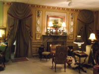
As much as possible a well decorated room will look balanced from side to side and front to back.
This visual balance is achieved by attempting to equalize the size and mass. A piano on one side is balanced by a table and wall of art on the opposite wall etc. etc.
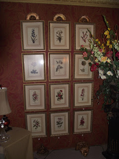
Art hung in a gallery effect.
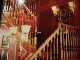
Each wall in the room should have its own focal point and balance. How the art is hung helps to create the focus. Too many people hang art in the middle of the wall. The art should be hung to emphasize the focal point of the wall. It needs to relate to the things around it. In my opinion stair wells are the only place where art can be hung without something under it.
When a wall needs art but there is no place or need
for something under it. Do a gallery effect.
INTERIOR DECORATOR INTERIOR DESIGNER
Use two or more pieces starting within six or eight
inches above the baseboard and stack them. This
creates a pleasing vertical line and creates a pleasing
focus.
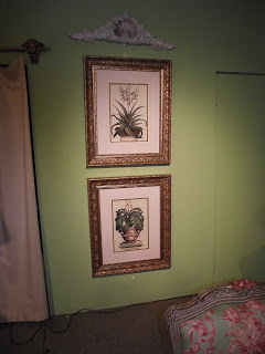
Two Prints stacked in a gallery effect
The wall behind the sofa, for example should always
have enough space filled to be important enough
to compliment one of the most important furnishings
in the room.
This can be done with one large piece of art or any number
of smaller pieces that look good together and compliment
each other. Often candle sconces are used as an attempt
to stretch art that is not large enough. This usually does
not work. One, because the sconce usually does not
have enough mass to fill the space and two, because are
you really going to burn candles over your sofa.\
Sconces with dusty candles that are never used are
very unattractive.
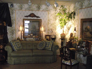
Art and accessories overlap to create an attractive vignette
Another common mistake is to hang art so that none of it
is blocked from view. When I help clients with art they
will often say, "I can't see that picture. Its behind the
lamp." I then explain. To make the wall come off
as l vignette the items must visually overlap. Otherwise
it is just a wall with a bunch of stuff on it. You want
the eye to first take in the total space and that being done,

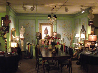
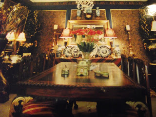
Dining room illustrates balance from wall to wall
vignette to vignette
examine the detail of each object. It also gives a "rich"
look. "I have so many objects I don't have to see every
inch of every one of them."
Regarding the art you use, it is better to have
a good print than a crappy cheap looking
oil painting. Oil paintings are great if you
can afford well done ones. The so called
bargain oil paintings you buy off the back
of a truck or the advertised "oil painting
hotel sales" "sofa size oil paintings for
$100. dollars" are junk. They are what is
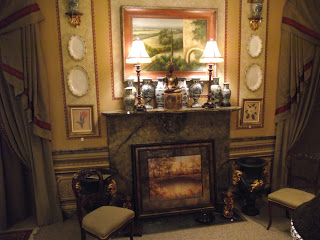
Oil painting and accessories decorate mantle
known as conveyor belt oil paintings, if
they are even oil paintings. Conveyor belt
"art" is when the canvas goes down the line
and one person paints a sky, another paints
the clouds, another does the trees, another
does the land scape and still another does
the ever present lady with a parasol.
The good oil paintings most people can afford
are ones that although they are repainted are
done by one artist who paints each one from
sketch on canvas to finish. While the scenes
are similar, because each is painted one at a
time by the same artist each one is a little
different. Few of us can afford originals,
which might be investment quality.

A collection of objects create a focal point over a sofa
Decorative repainted oils are only investment
in that with inflation they cost more to buy
each year.
Another thing to avoid are those awful
fake oil paintings. The "art" is printed
on a surface that is textured to look like
brush marks. Of course the brush marks
have no relationship to the picture,
A print has always been affordable art.

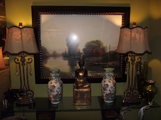
What is wrong with this setting?
The art is a little heavy for the small table
and the fruit plaques make the entire
vignette too wide for the table.
When you see a print you know what it
is. That is the beauty of it . A print is not
trying to deceive anyone. There are of course
different kinds and quality prints. There are
hand colored prints, where a colorist paints
the colors in with water colors. With the
cost of good matting and framing, even good
prints can be expensive. The point is
that it is better to have a good print than to
have an imitation oil painting or a badly
done oil painting. If you can't tell the difference
get someone who can to help you.
Lastly, if you can afford oil paintings; they are not
appropriate in every setting. They imply a formal
setting. While I have seen it done, I don't think
oils are appropriate in bath rooms or kitchens.

Small vignette with stacked art
As always,I hope you found this useful and fun.
Please tell your friends about my blog and let me know
what you think.
Bill Gantt
Be sure to check out my Holiday Decorating blogs.
Posted now:
How to make roses out of ribbon
Christmas gift wrap with roses
Christmas decorations from roadside weeds
How to make a Tea Cup Tree
New Christmas decorating blogs will be posted every week!
Mark your calendar-Holiday Open House-Dec. 1 & 2